Summary
Evite is one of the oldest virtual invitation services around, having opened their doors way back in 1998. Since then, there are more and more players in the online invitations market, like paperless post, punchbowl and hobnob. To drive engagement and improve retention, Evite has been enhanced mobile user experience and developed new feature: text invitation.
challenge
objective
ROLE
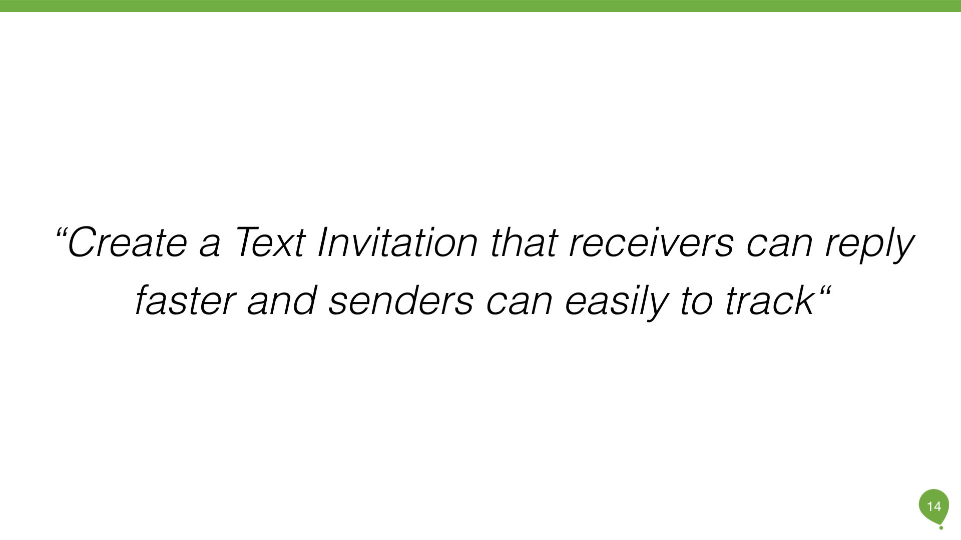
Create a Text Invitation that receivers can reply faster and senders can easily to track
UX/UI Designer
Results
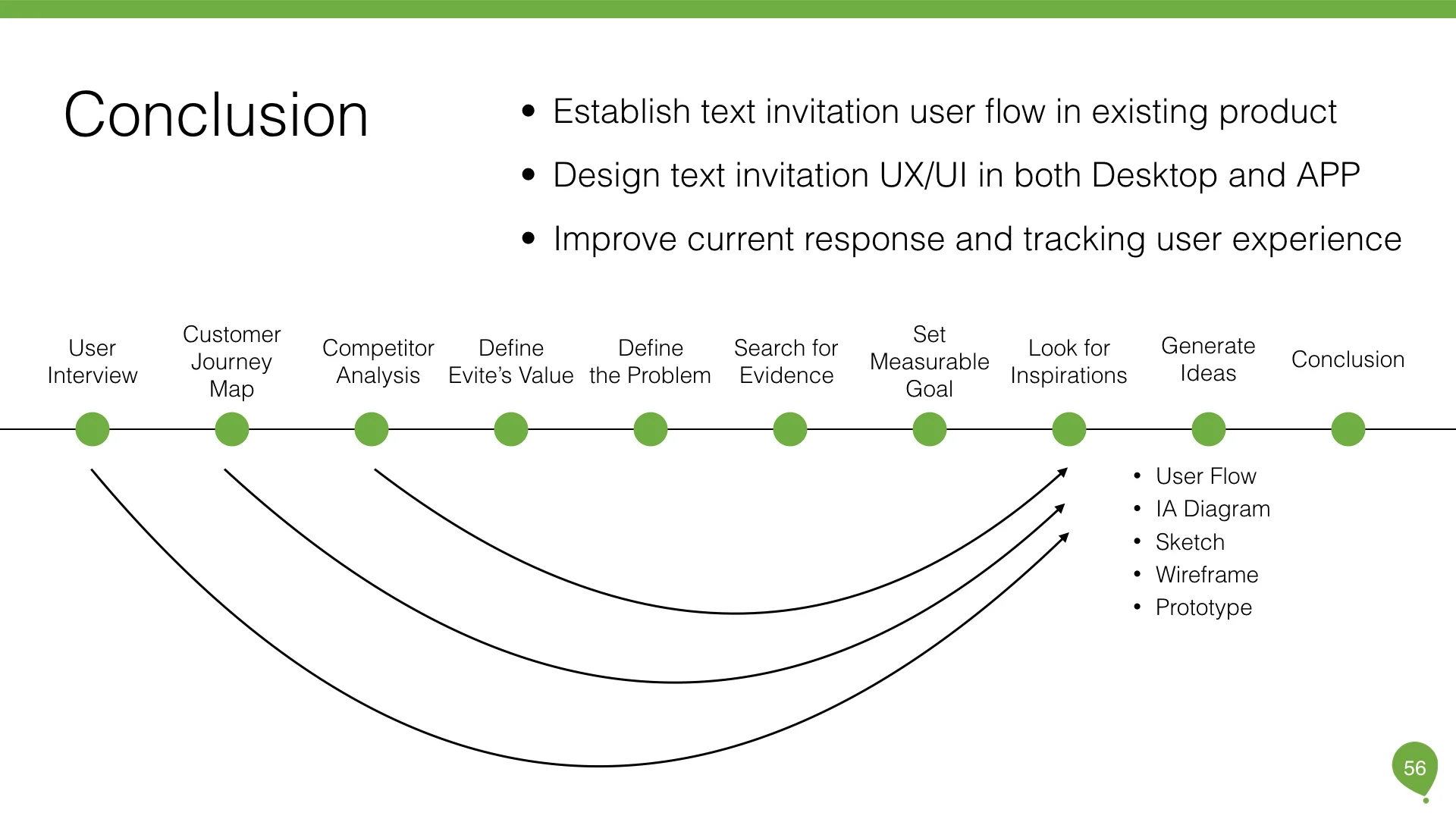
- Establish text invitation user flow in existing product
- Design text invitation UX/UI in both Desktop and APP
- Improve current response and tracking user experience
I. Evite's Core Value
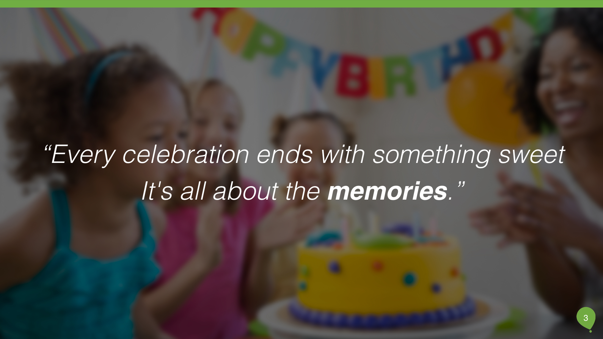
To approach the problem, I needed to find out Evite's core value. Why people create events? They want to share happiness. When I dived deeper, I found that the only thing left is memories. Yes! We're creating memories. Also, the more people share, the more people will engage. Therefore, the sweeter memories we'll remember.

II. User Research
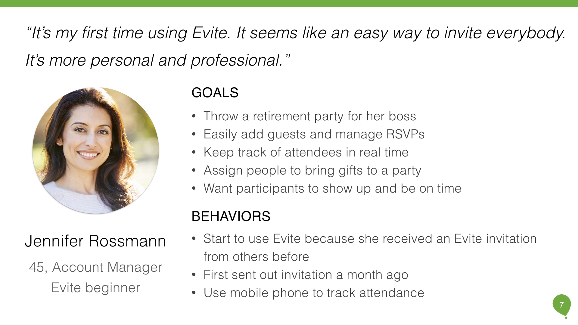
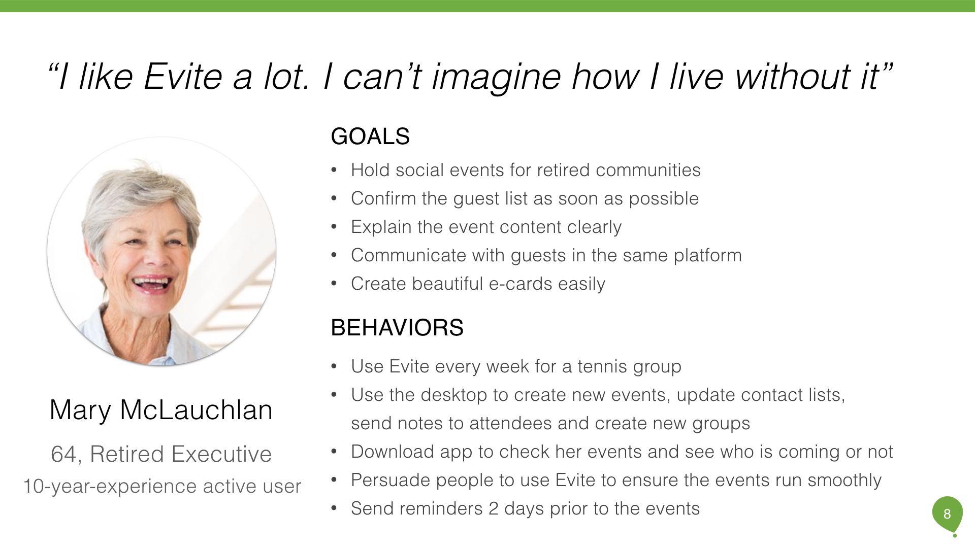
2a. User Interview & Personas
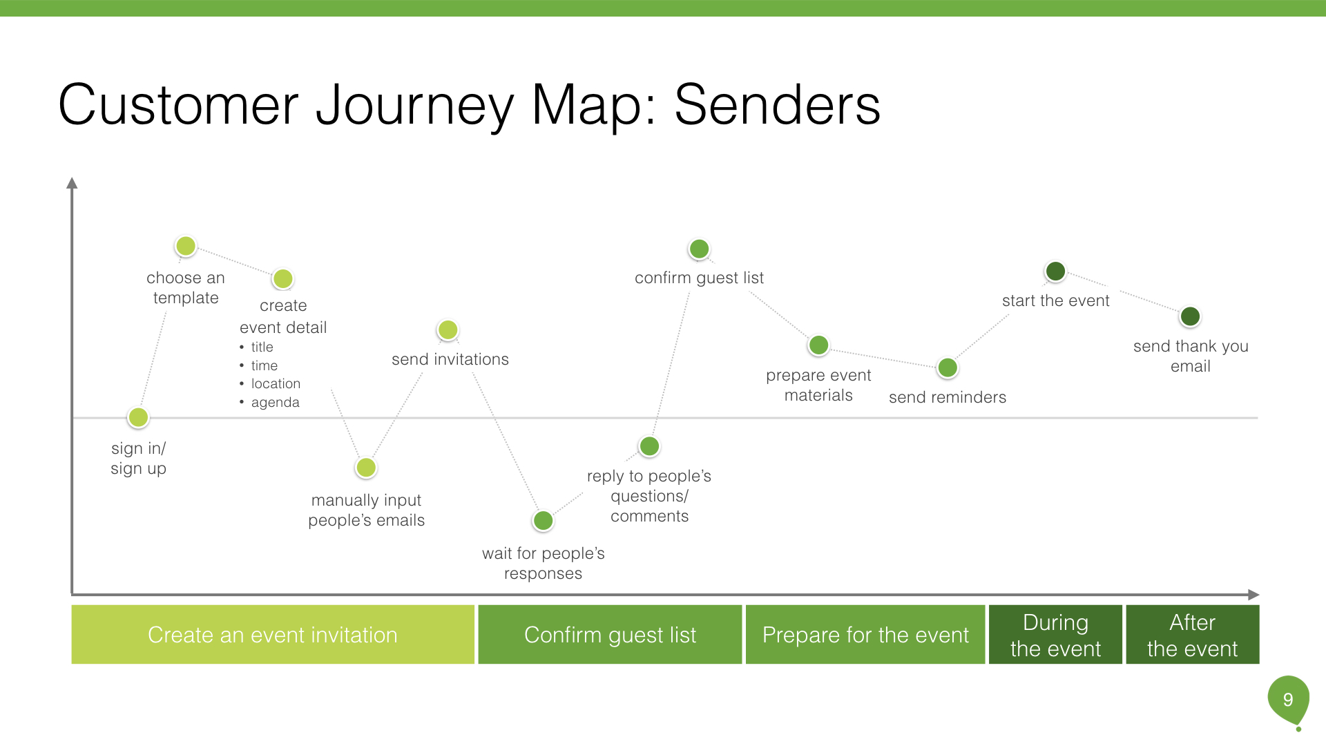
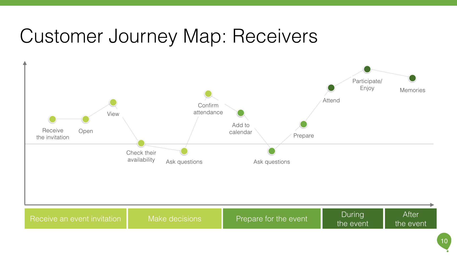
To conduct user research, I interviewed with Evite users and created customer journey map: both senders and receivers. Receiver's user experience is as important as Sender's because most of the users knew Evite from senders' invitations. Through user interviews, I went through the invites creation process and understood their pain points. What's more, I discovered different user behaviors between mobile devices and desktop. Those truly helped me find users opinions, problems, reasons, and motivations.
2b. User Journey
2c. User Research Insights
III. Competitor Analysis
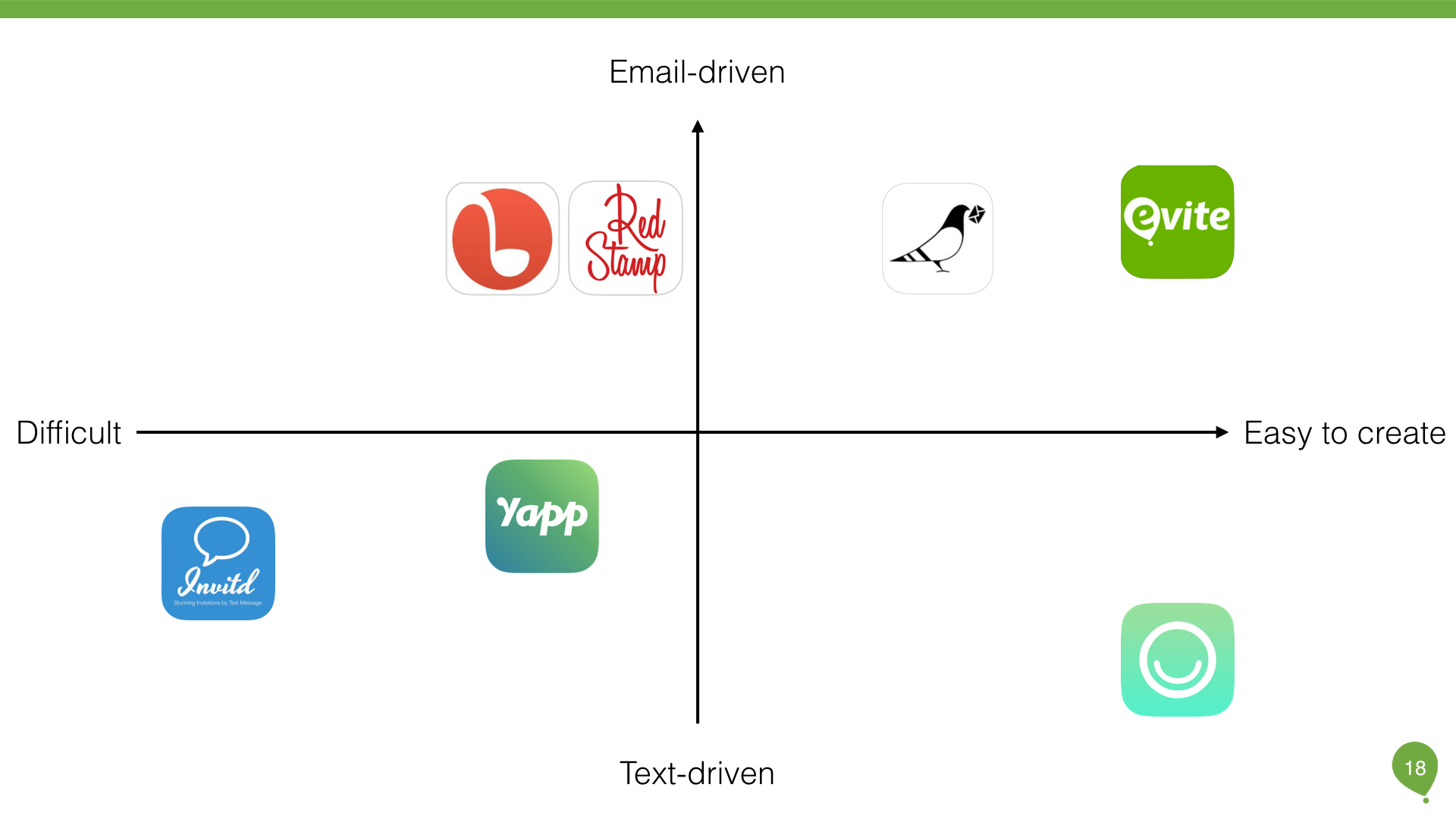
However, as the technology became matured, there are more and more players in the market, such as Paperless, Hobnob, Punchbowl, Invitd. To understand the latest trends in design and functionality and the market opportunities, I started to conduct competitive analysis: identify competitors and analyze their product’s design.
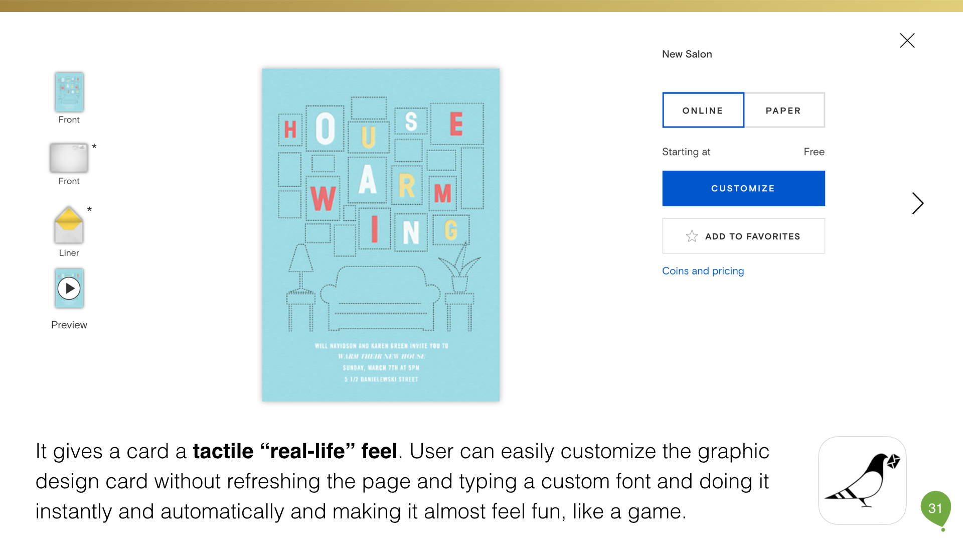
I've looked up the competitors in the market and selected three main competing products: Hobnob, Paperless, and Invitd. I downloaded those apps(desktop applications) and played around. Hobnob user experience is really smooth. It's easy to create a text invitation. Also, guests don’t need to download an app to RSVP. Lots of users mentioned the convenience in the reviews. On the other hand, Paperless's design is flawless. It’s distinctive, customizable designs and powerful online tools make it easy to communicate expressively on any occasion.
To conclusion, competitor analysis helped me to understand the invitation flow, technical issues and identify the strengths and weaknesses of competing products/services.
IV. Problem Statement
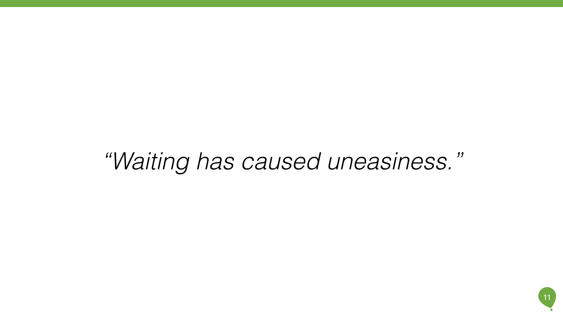
Therefore, I started to draft the problem. This is a crucial part of UX process. What kind of problem we're trying to solve? It should be a people-problem, which is human, simple and straightforward. When I reviewed the user interviews and customer journey maps, I found out senders get most anxious when waiting for responses. That is longest process receivers take as well.
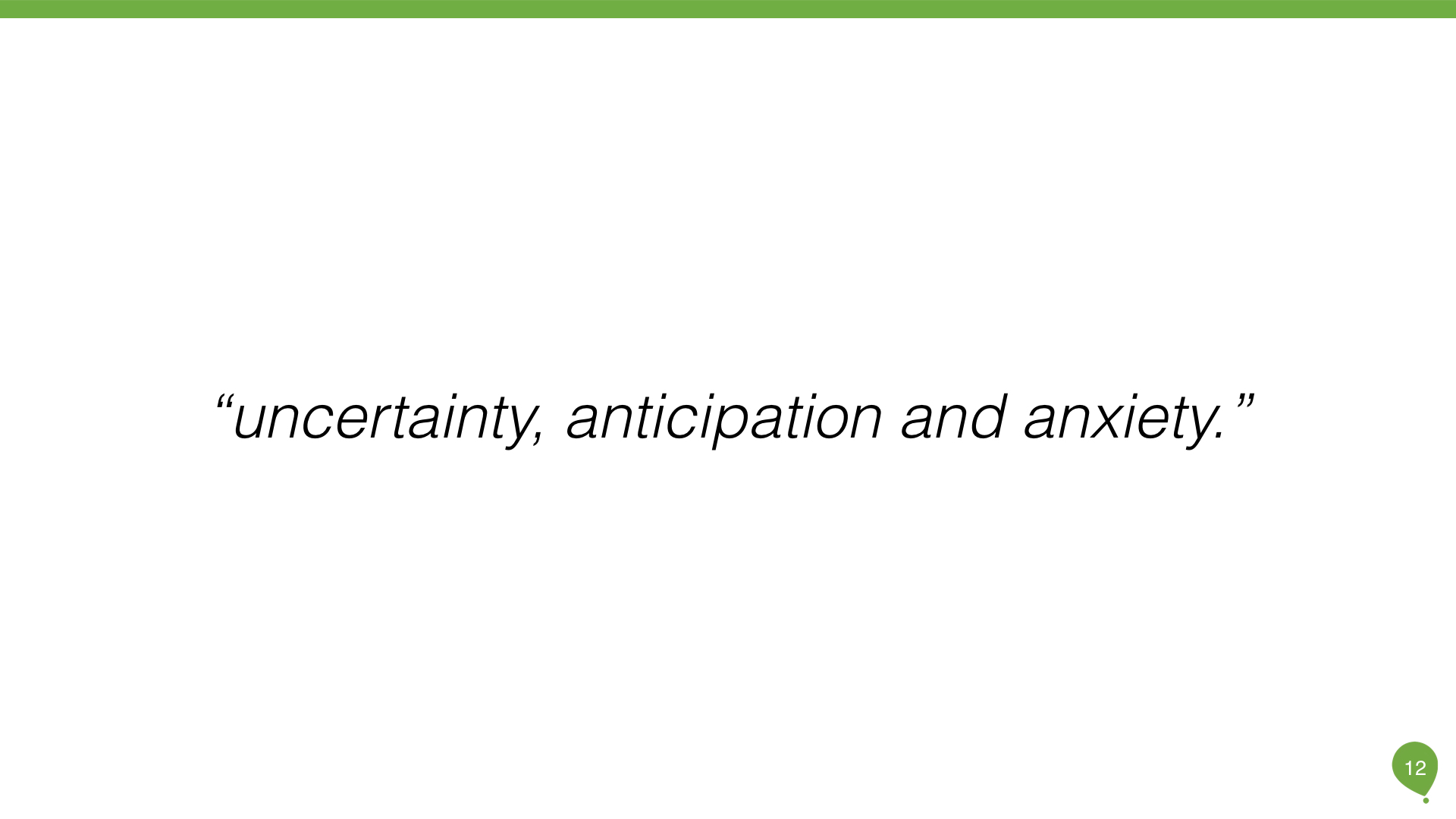
Yes! That's a people-centric problem! I can understand how it feels. "Waiting has caused uneasiness." There's a lot of uncertainty, anticipation, and anxiety. Your whole system is primed to receive a message back. At the same time, is there any ways to facilitate receivers to respond? Therefore, I made the assumption:
"Users feel anxious when people don’t respond. Users want to get faster responses."
V. Solution & Supportive Evidences
To suggest a solution, I researched psychology papers and articles to evaluate my problem statement.
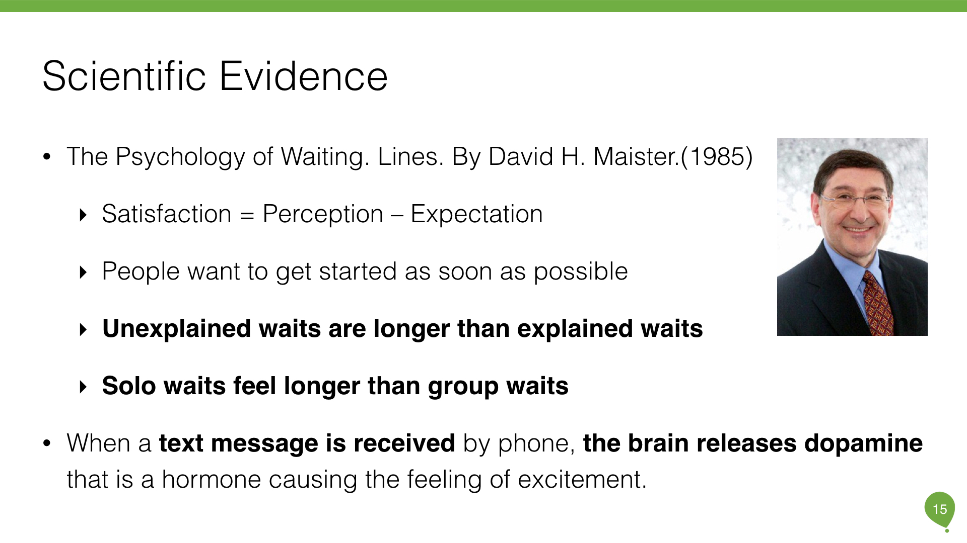
"It’s a perceived lack of control over your environment and the uncertainty that leads to such extreme email anxiety," says Julie McCarthy, a professor of organizational behavior and human resources management at the University of Toronto Scarborough. "What’s more, our text messaging and Facebook-liking culture has conditioned us to expect an immediate response." written in a BBC's article. One paper I found is intriguing is The Psychology of Waiting Lines, by David H. Maister. He examined how waits are experienced and offered specific managerial advice to service organizations. Those statements approved my assumption.
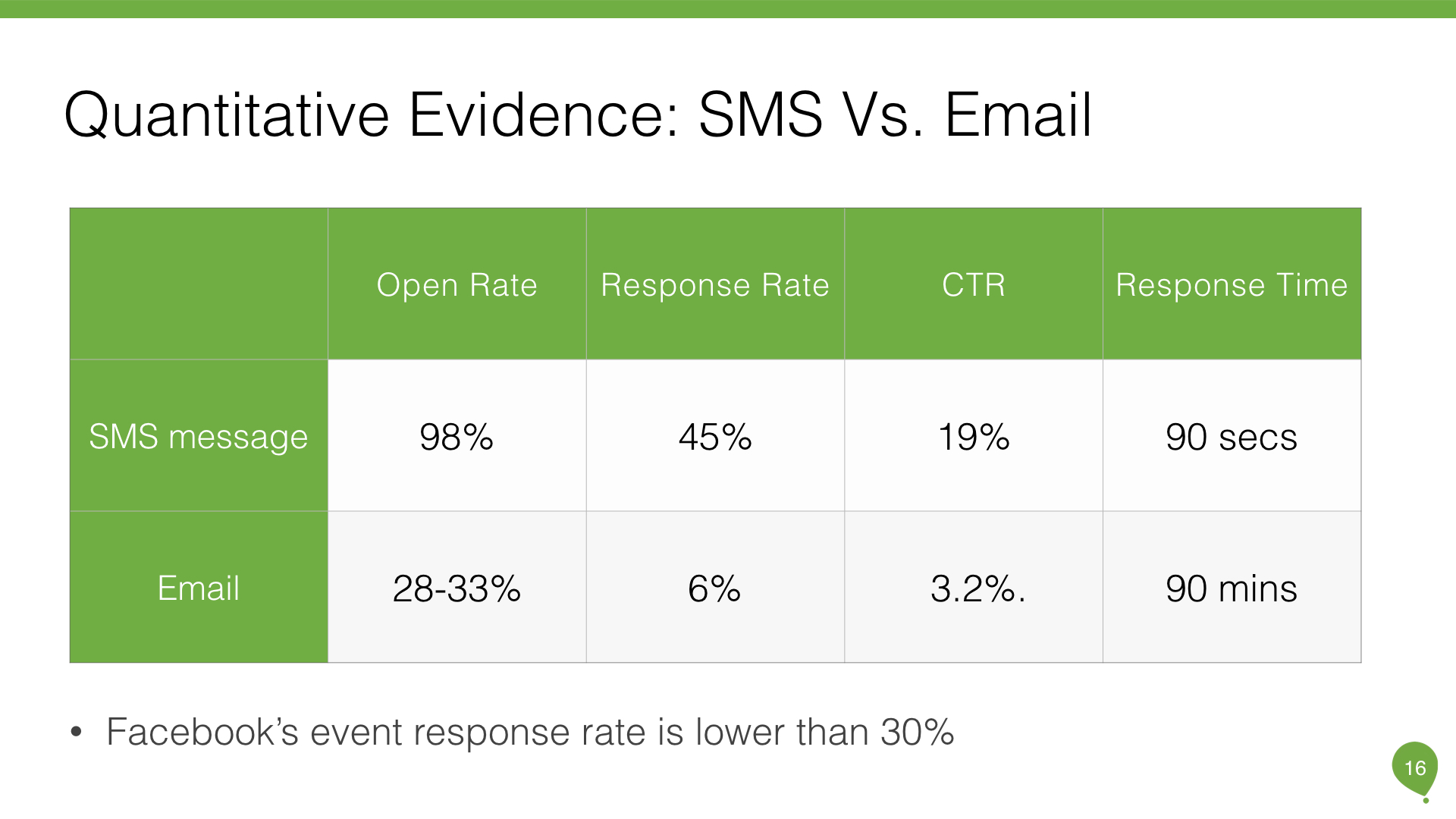
Therefore, I wrote the solution: "Create a Text Invitation that receivers can reply faster and senders can easily to trac." Then, I discovered impressive statistics about the difference between email and text, social media as well. Furthermore, the Coca-Cola Company says it spends 75 percent of its mobile budget on SMS marketing. Then, I set the success criteria to measure if we indeed solve the problem.
VI. Success Criteria
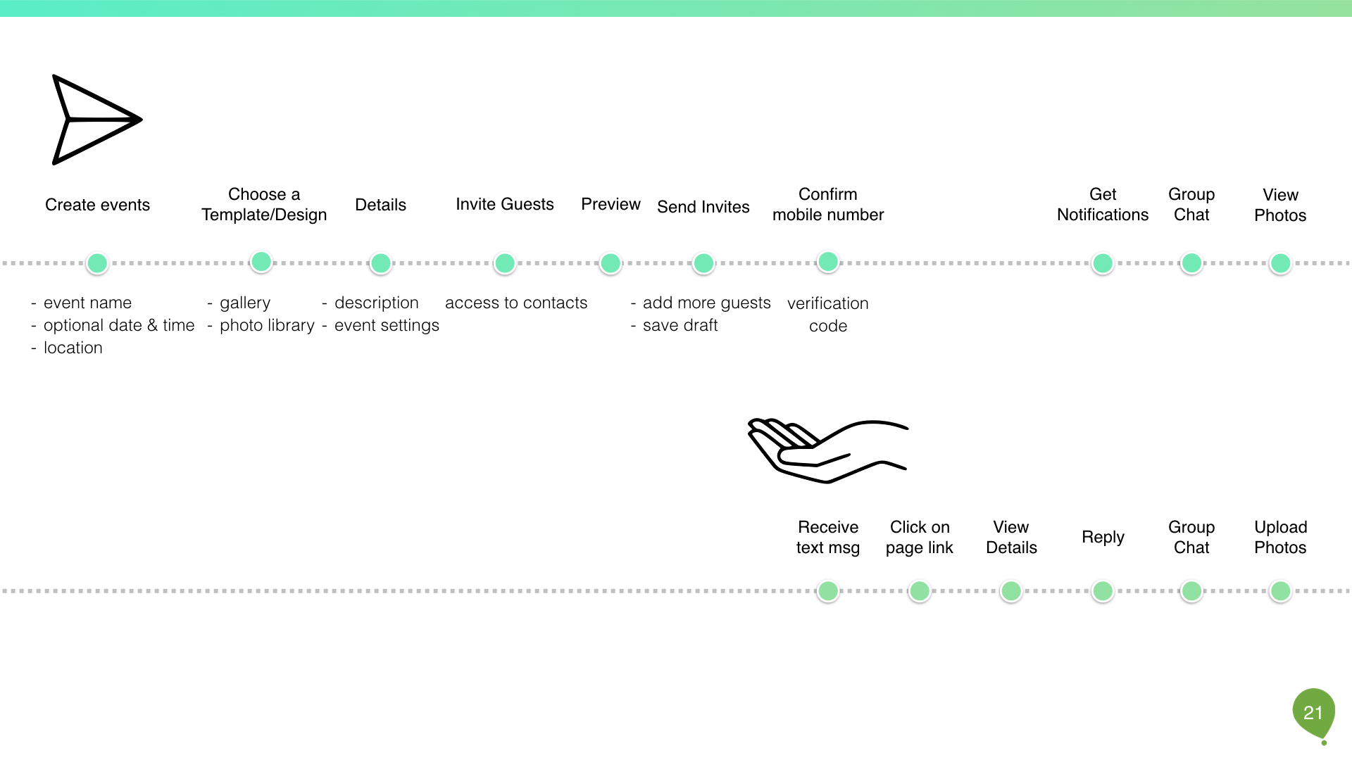
VII. User Flow
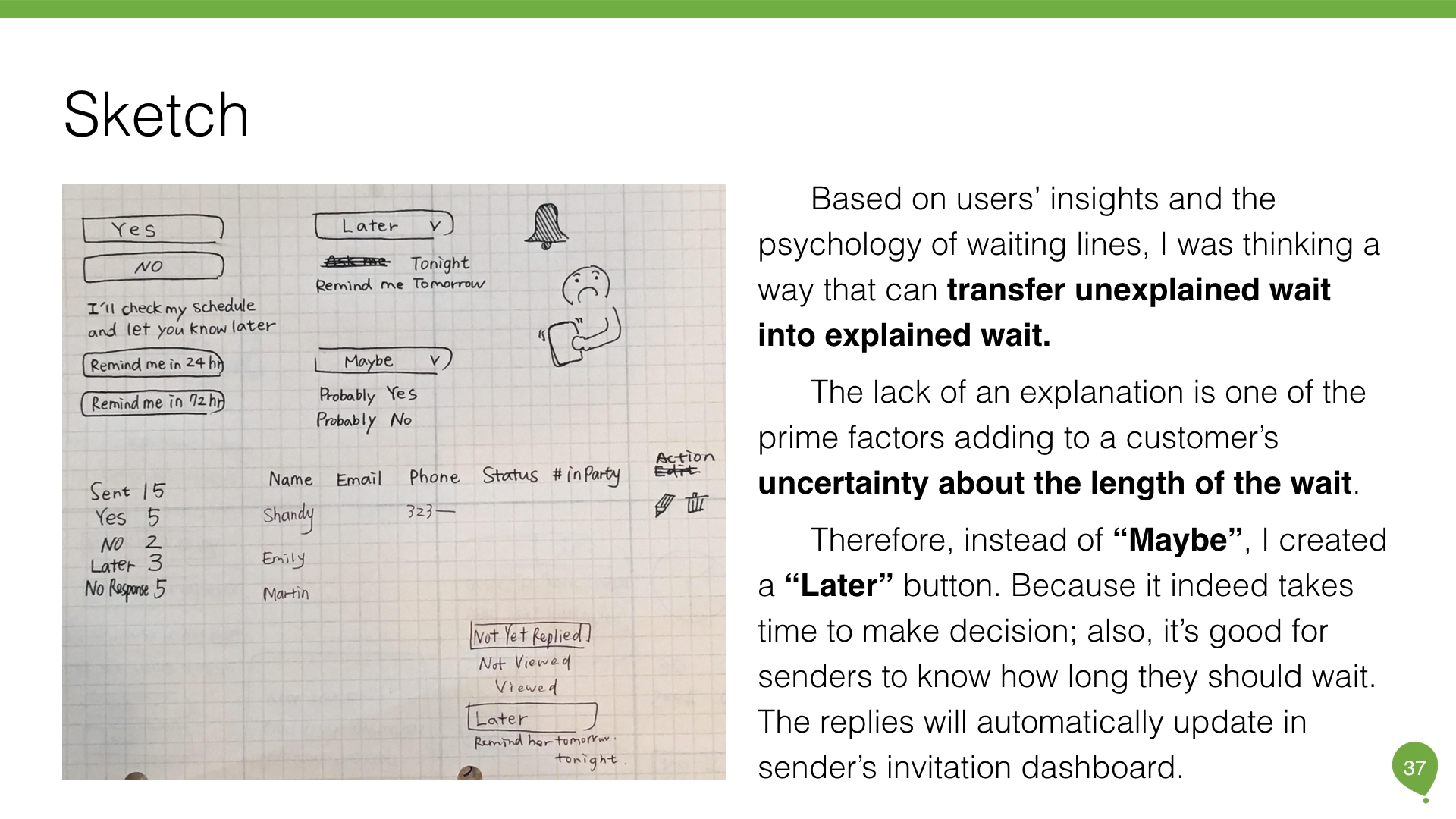
Based on users’ insights and the psychology of waiting lines, I was thinking a way that can transfer unexplained wait into explained wait. The lack of an explanation is one of the prime factors adding to a customer’s uncertainty about the length of the wait.
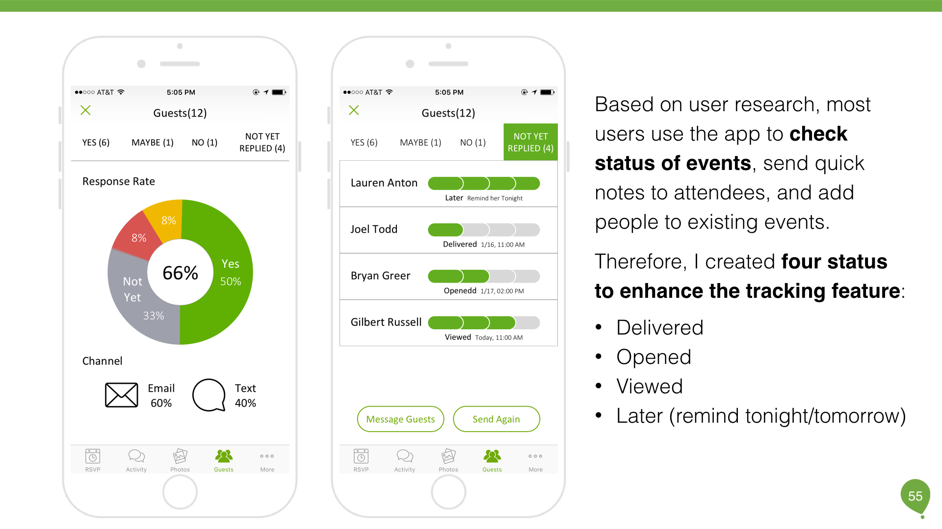
Therefore, instead of “Maybe,” I created a “Later” button. Because it indeed takes time to make a decision; also, it’s good for senders to know how long they should wait. The replies will automatically update in sender’s invitation dashboard.
Then, I created the user flow to figure the process. IA diagram is to figure out how this process fits into the current pages/flow. Sketch and Wireframes are for visualize the solution.
VIII. Wireframe & Sketch
IX. Prototype
The biggest challenge I met during prototyping is how does the new feature fit in the rest of the product and what screens I needed to redesign. For a senior UX designer, we could not just create whatever we want. We need to know the limitations and figure out the simplest solution for clients.
- Where: where should users add contacts numbers? desktop? app?
- When: when should users send text invitation?
- What: what will user see in their screens?
Therefore, I created the IA diagram that helps me to analyze the current flow and determine what screens I should add when sending text invitations.
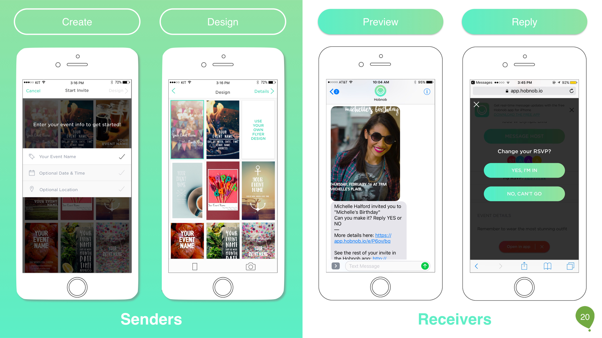
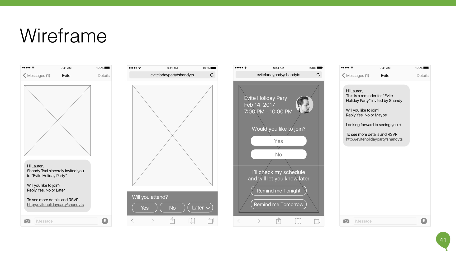
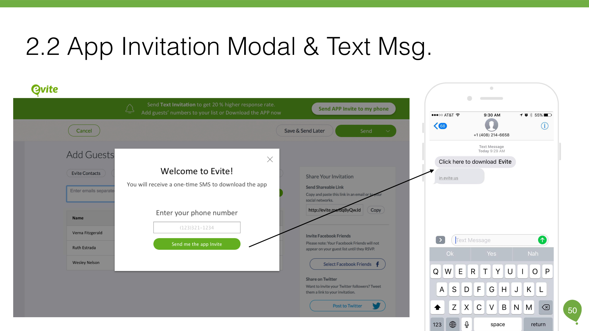
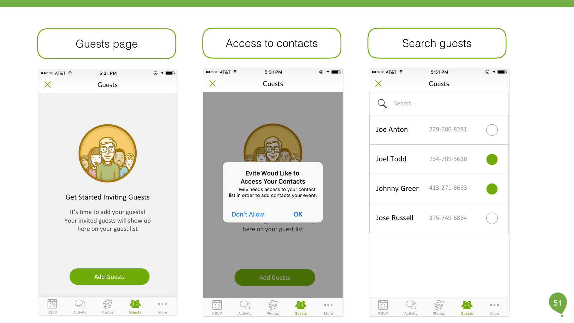
There are two ways to create text invitation: through desktop or mobile app.
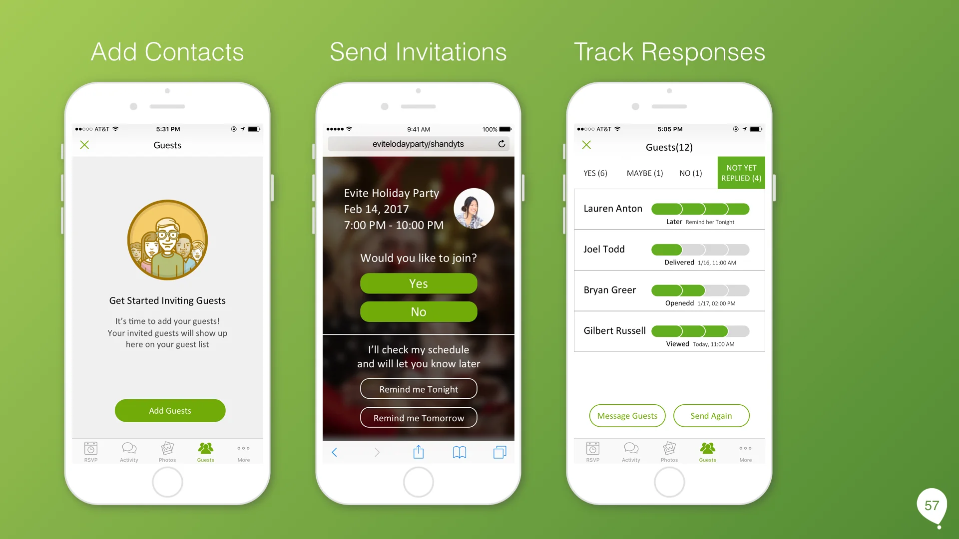
According to user interviews, most users use desktop to create new events and upload guest list. So, in the desktop version, I add a phone column in Add Guest page where users can input guests' numbers or upload contact file. After users click send button,
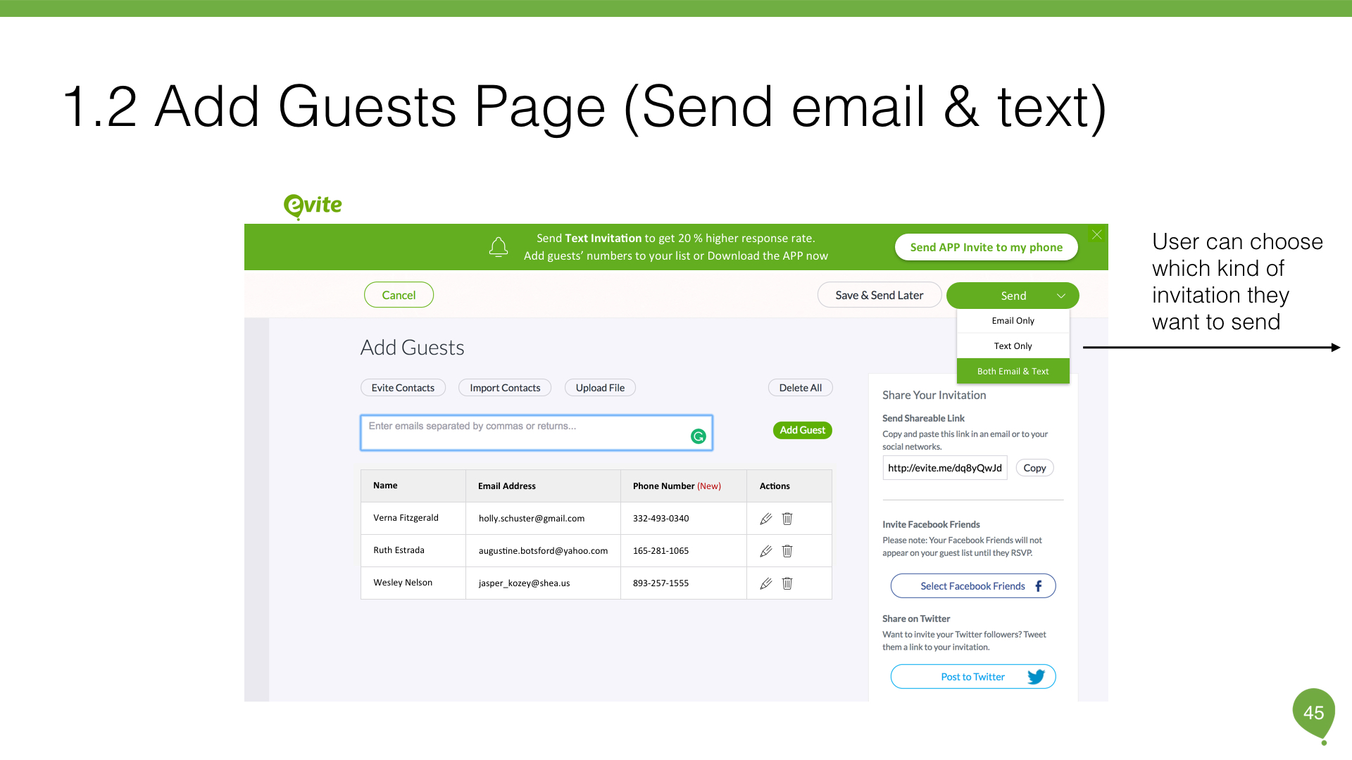
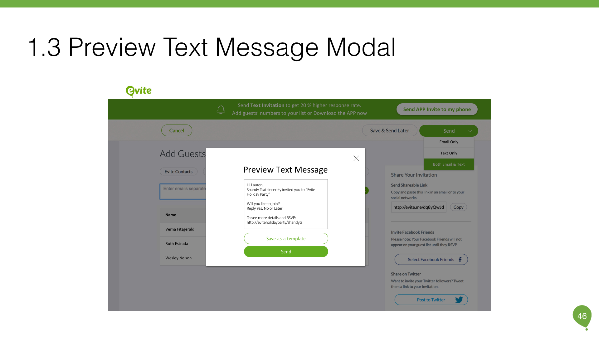
I provided the options that users can decide which channels. If they hit send text invitation, users can preview and edit the text.
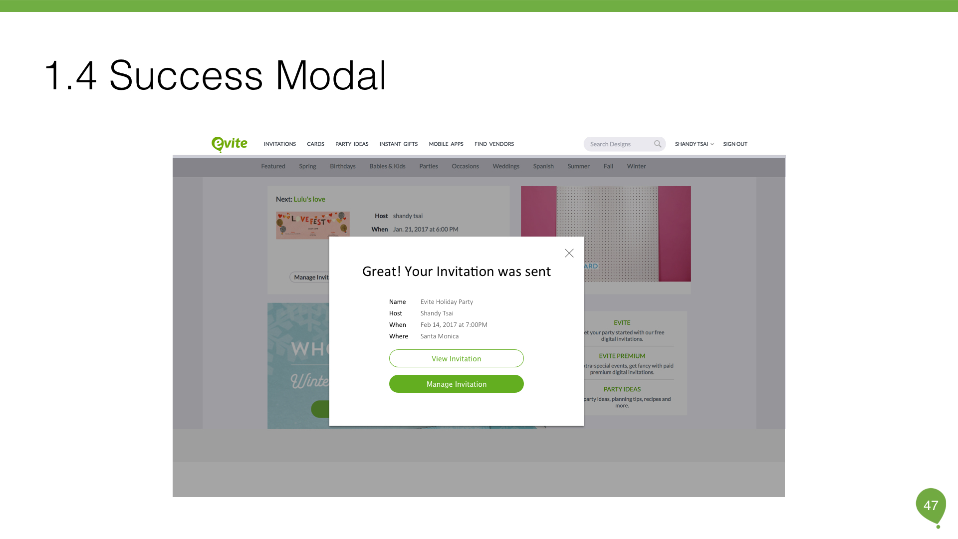
Last screen is a confirmation model where they can view and manage invitation.
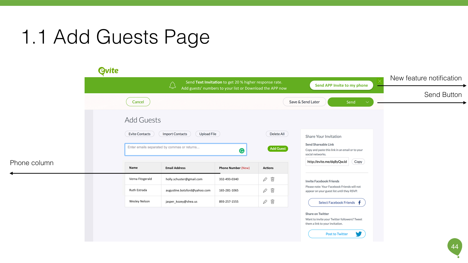
However, how would users download the app? Referred to Invitd, they send out the app invitation through SMS. That's really smart! Therefore, I designed a notification bar on the top and a CTA that motivated users to download the app where they can upload their guest list.
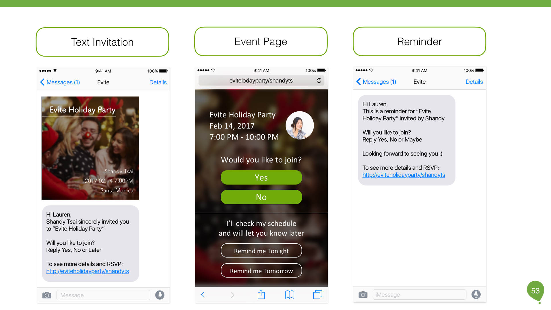
From a receiver's perspective, I would like to receive a text message that is polite, sincere and friendly. So, I save the invitation as an image that receiver could have a high-level understanding of the event. When they click the event page, it will show up more details.
Inspired by iOS system update and customer journey map, it takes time for users to make decisions. Instead of ignoring the question and give a certain answer, why don't we provide a subtle way for users to have final words? That is, in the middle screen, users can select "Remind me tonight" or "Remind me tomorrow" to postpone the answer. On the other hand, senders will get notifications. With this feature, we transfer the unexplained wait into explained wait. As a result, it reduces the uncertainty and makes senders feel much released.
X. Conclusion
“Text Invitation,” Lauren said. "That's it?" I asked.(hope it did not sound too surprisingly)
"Yes, that's exactly what we want to develop," she confirmed.
Text invitation seems straightforward. However, when I figured out how it works and what the current product looks like, I realized it's way more complicated as it sounds.
To my opinion, UX is always an intriguing problem-solving process. It's not only about empathy, but also logic to support your design. Like all good design, the process of getting to a simple solution is complex.
I enjoyed this case study a lot. Special thanks to Mary and Jennifer. During the interview with them, I was inspired with so many ideas. Hope you enjoy my design process and feel free to provide any feedbacks.